If you’ve found yourself wondering ‘what is UX design?’, you could be mistaken for believing the misconception that user experience (UX) is only about how a website looks. But the reality is that a website can have the best, most intuitive user interface (UI) ever, but if it takes 30 seconds to load the thing... every... single... time... the user isn’t going to care.

Poor web performance can quickly turn a positive user experience sour, making it unlikely users will stay on the website and even less likely they’ll become customers.
In this first of a series of web performance articles, we’ll learn why good web performance is a critical part of creating a positive UX design process for your website’s users.
What is web performance optimisation?
Web performance optimisation – also known as WPO or Front End Performance – is an area of web development concerned with making websites faster. This applies not only for the initial load into the browser, but for any user interaction or additional loading that happens after.
Generally it involves the following:
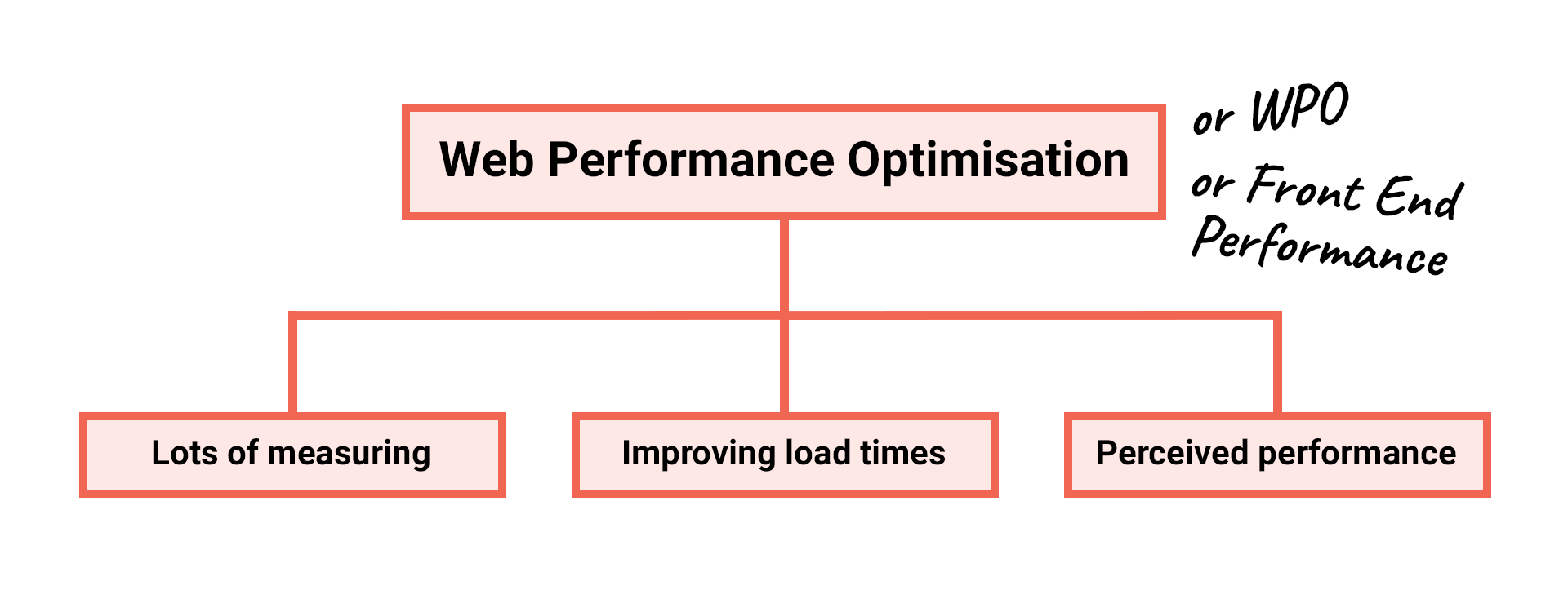
Lots of measuring: Measuring performance and recording metrics relating to how fast a website loads.
Improving load times: Once we’ve recorded load time metrics, the next step is to improve them. This will, in turn, improve user experience. This is done through performance optimisations which reduce http response latency (the time it takes to get a website’s assets from the server to the browser). This allows the browser to render the website quicker.
Perceived performance: Web performance is also influenced by psychology and the user’s own perception of loading. Many optimisations involve creating a perception that the website is loading faster than it actually is. Where that’s not possible, it's about helping the user deal better with the wait.
At its core, web performance optimisation is about accommodating and looking after users by making things happen faster. This can save them time and money in the process and drive their engagement.
Accommodating users
Every year the web grows more complex, with websites now larger than ever and doing more complicated things than before. Meanwhile, it’s being accessed using many different device types under many different network conditions.
There’s the latest and greatest desktop and mobile devices:

Budget and legacy devices:

And the devices where web usage is on the rise:

The sheer variety of ways to access the web means websites with performance optimisations are going to offer very different user experiences to those without.
For example, here’s an iPhone 8 on a 4G connection loading CNN:
It takes 4.5 seconds for the content to begin rendering, with 13 seconds passing in total before everything is fully loaded. Not amazing user experience, but it’s usable.
Now here’s the same website loading on a less powerful Moto G4 on a slower 3G connection:
Here, the user is stuck looking at the white screen for a huge 12.5 seconds, with 51 seconds passing in total before everything has finished loading. A much poorer user experience.
By the time the iPhone 8 user on the right is able to engage and interact with the website, the Moto G4 user is still staring at a white screen. When you see them side by side like this, it really puts the huge difference in loading experience into perspective, doesn’t it?
If a website is poorly optimised, these budget devices will struggle with loading performance. This leads to a slow, unresponsive, inaccessible website which will just result in a frustrating user experience.
If a user isn’t able to engage with a website and interact with what has been built, it's unlikely they'll sit waiting patiently. When things don't work as expected, they’ll just abandon the website and go elsewhere. This is solely down to poor user experience.
Google discovered that on 70% of the mobile landing pages they analysed, it took more than 5 seconds for the visual content in just the viewport to load, whilst it took more than 7 seconds to fully load all content.
Source: New Industry Benchmarks for Mobile Page Speed
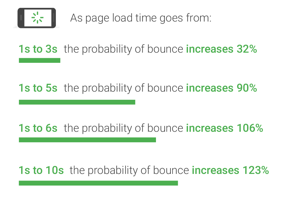
They estimate that as page load times go from 1 second to 10 seconds, the probability of a mobile site visitor leaving immediately – AKA 'bouncing' – increases by 123%.
Also, the BBC found that for every second it takes for their website to load, they lose an additional 10% of users.
Given that (according to Google) more than half of users abandon the visit if a mobile site takes over 3 seconds to load, it’s little wonder that lots of websites are losing lots of users. And it's all down to their lack of consideration for performance.
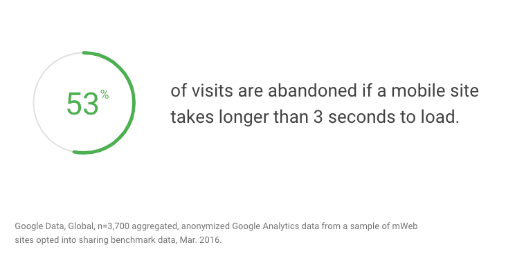
Source: Mobile Site Abandonment After Delayed Load Time
Looking after users
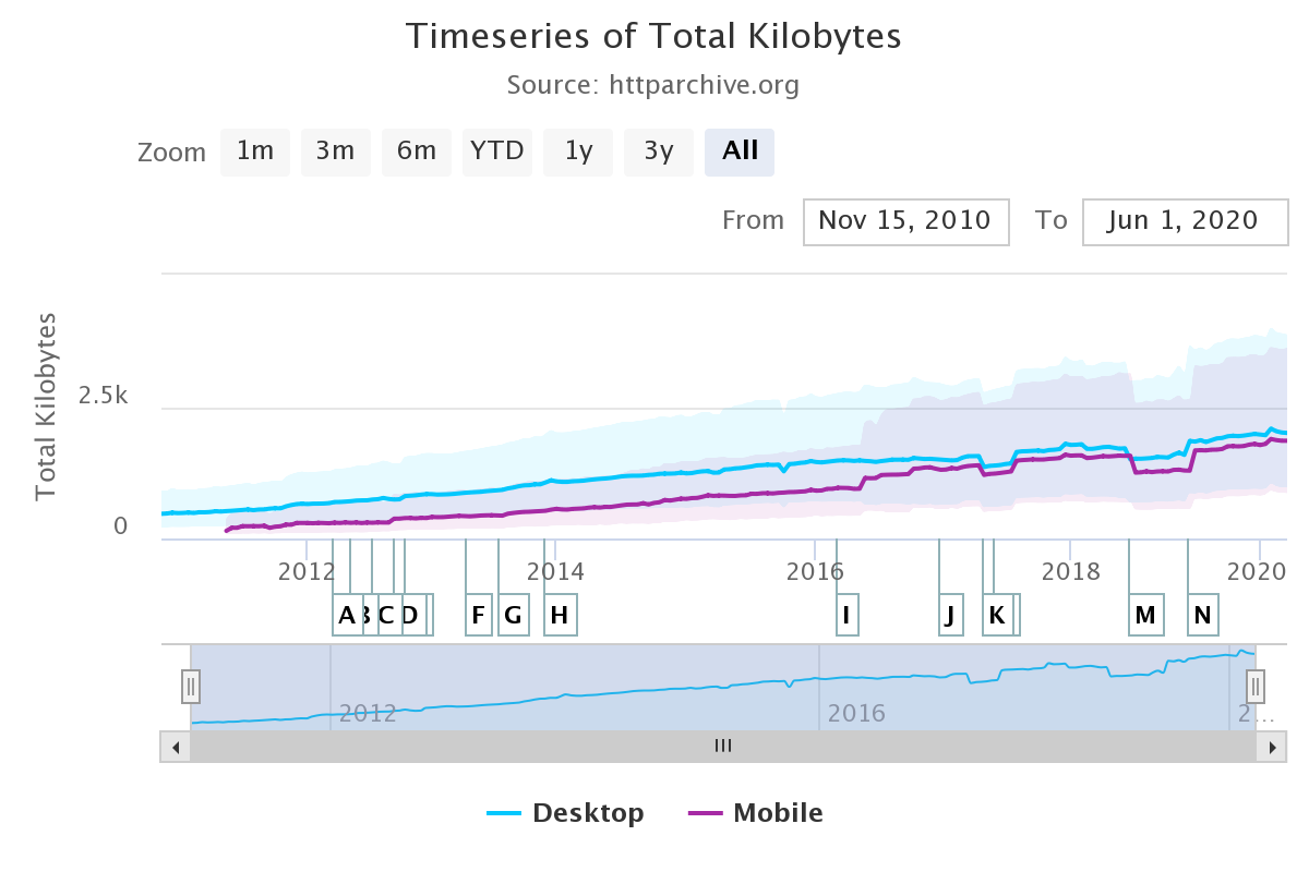
According to the HTTP Archive, the median mobile page weight (the middle point of all recorded pages based on their file sizes) has steadily risen since 2011 from around 150KB to nearly 1.8MB today.
This is an increase of over 1000%.
But where have all of these bytes come from over the years? Using the archive, we can find the culprits.
The size of HTML documents on mobile has remained relatively consistent over the past decade. In 2011, the median size was 19kb, whilst today in 2020 it's 26kb. A 30% increase.
What about all the assets the HTML requests? First off, the median amount of mobile requests here has nearly tripled since 2011, so even if the request sizes were the same, you would still have more bytes.
Not that request sizes are still the same. They’ve grown quite a bit. Let’s see how they compare:
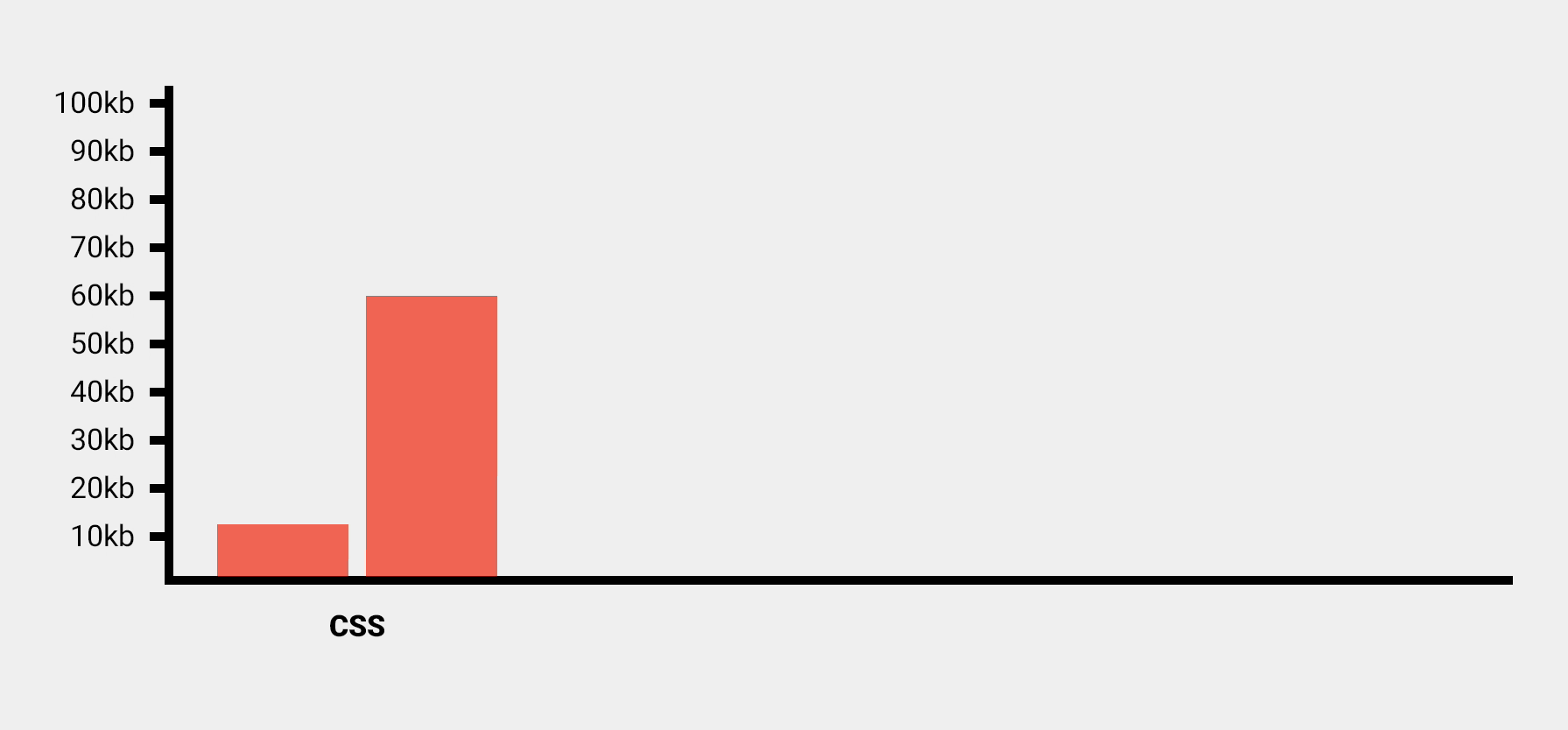
With CSS (what styles the webpage), the median on mobile has risen from 12kb to 60kb, which is an increase of 400%.
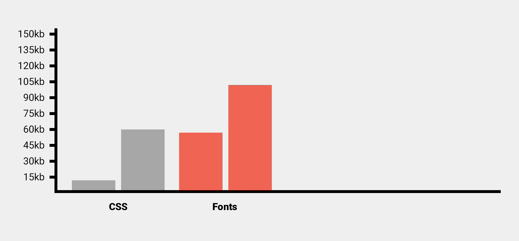
We’re now using more web fonts in designs. In 2011 going from a median of 57kb to 102kb in 2020. An increase on mobile of 79%.
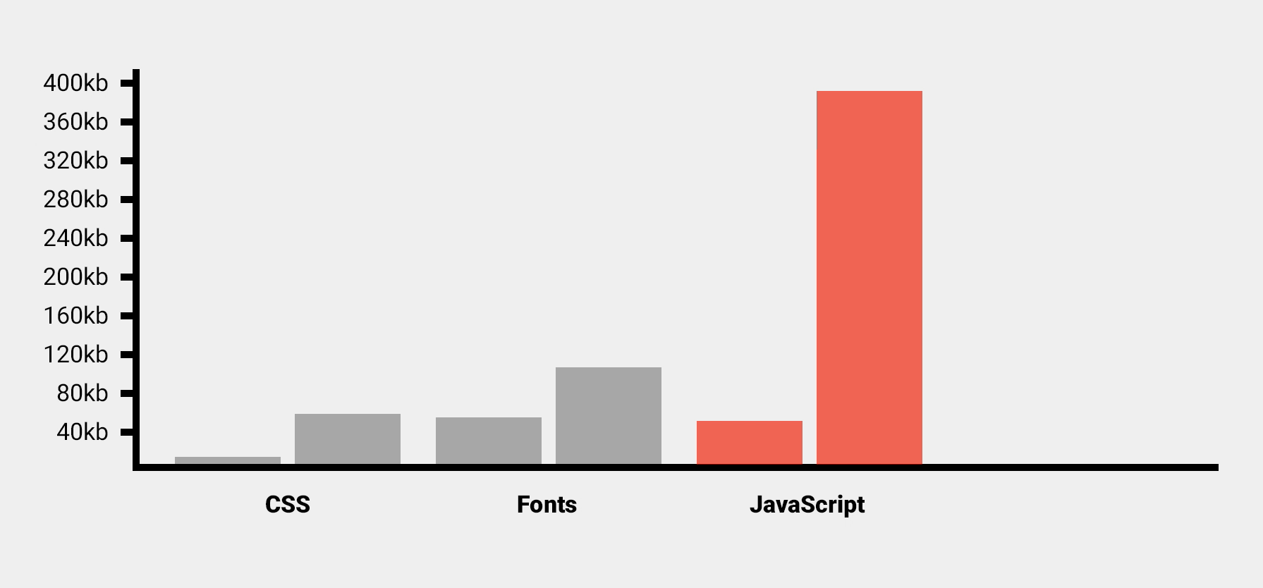
The median size of JavaScript bundles (what makes the page interactive) has also grown considerably, which given how far that language has developed this past decade, comes as no surprise. In 2011, mobile sites served a JavaScript bundle size of around 52kb. Today that figure has risen to 391kb. A huge increase of 651%.
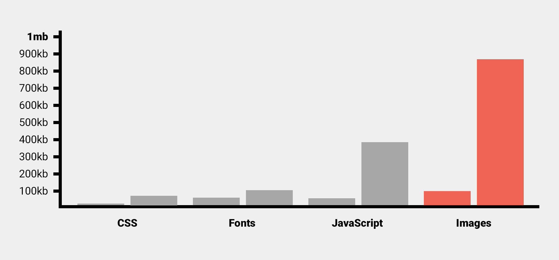
Images have also grown considerably. In 2011, the median image weight (file size) on mobile was around 100kb. Now in 2020, it’s not far from a megabyte, sitting at around 875kb. A massive 775% increase.
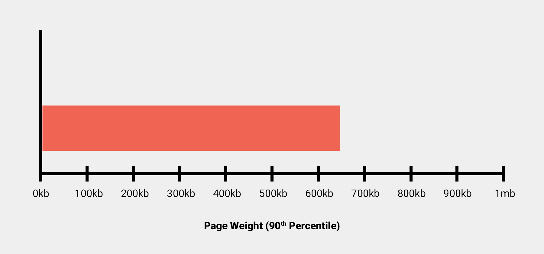
And remember, these figures only represent the medians. Coming back to the overall mobile page weight, looking at the extremities of this data set, we can see that in 2011 the 90th percentile and above (the heaviest 10% of websites) was already around 650kb. That's nearly two thirds of a megabyte.
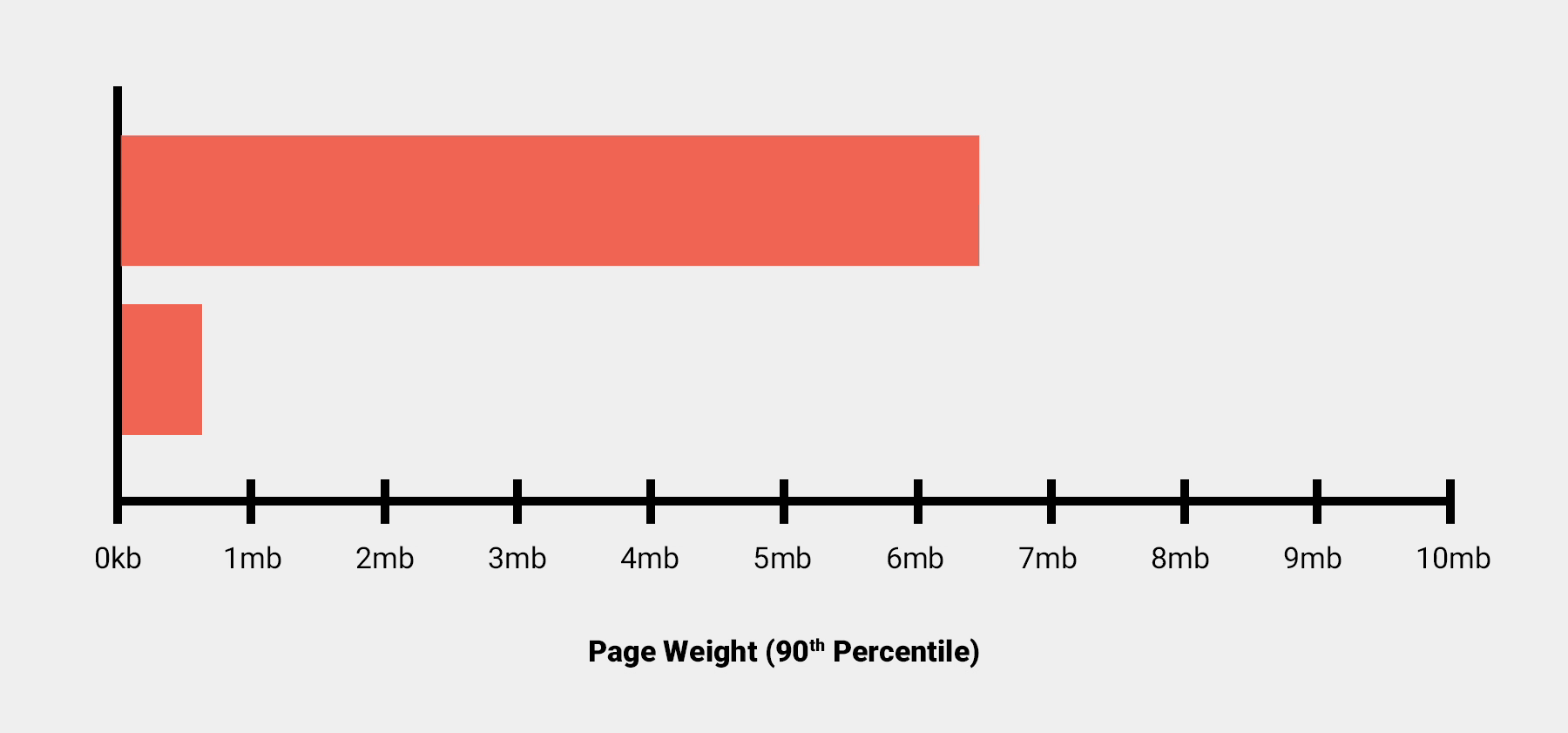
Now, in 2020, the heaviest 10% of mobile websites weigh nearly a whopping 6.5mb.
Why does all of this matter when lots of people today have multi–gigabyte data plans? 7MB is just a drop in the ocean, right?
Well, here are a few reasons why it matters.
- There are countries where the most common way of accessing the internet is via a pay-as-you-go system which charges by the megabyte.
- Users on smaller data plans would see their allowance rapidly used up.
- Users abroad on international roaming get charged by the MB. If I were a tourist on holiday outside of the EU, a visit to CNN.com (which weighs around 11mb) would cost me a whole pound sterling just for the single page load.
Using data from whatdoesmysitecost.com, we can also generate relatively accurate costings from across the world showing what percentage of daily income it would cost to visit a website.
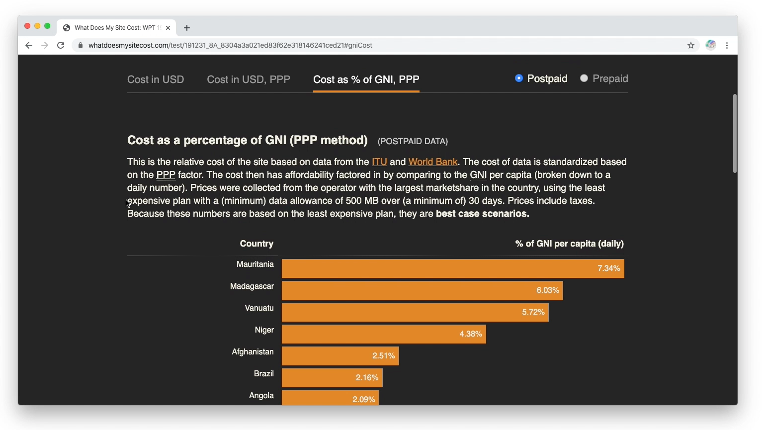
For example, for users in Madagascar, in the best case scenario a single visit to CNN.com would cost them around 6% of their daily income. In contrast, the equivalent percentage figure for the US is 0.47%, and for the UK, even less – 0.17%.
On top of the cost factor, websites such as government information portals, hospitals and crisis centres must absolutely serve a fast, lean user experience. Anything less could restrict access to important information during times of crisis, or worse – endanger lives.
To demonstrate, under the same MotoG4 test conditions as earlier, CNN takes a whole 13 seconds before anything renders in the viewport, whilst gov.uk, an important information portal in the UK, only takes 4.6 seconds.
Time and effort has obviously gone into optimising this website.
Summary
If you don’t accommodate your users by supporting different device types and network conditions, you risk a negative user experience and a huge missed opportunity for potential customers.
We also have a moral responsibility to look after users by optimising our website’s performance. This is so we don’t burden them with unnecessary costs or delay their access to important information and resources.
UX isn’t just about the visuals. You need a fast-loading website so users can experience them properly.
To find out more about how Web Hosting or Cloud Servers from Fasthosts can help you improve your web performance, check out our website.
