Revival of dead websites

Websites of the past reimagined

Since the dawn of the internet, websites have come and gone. Some disappear quietly into the ether, never to be seen again. Others don’t go down without a fight.

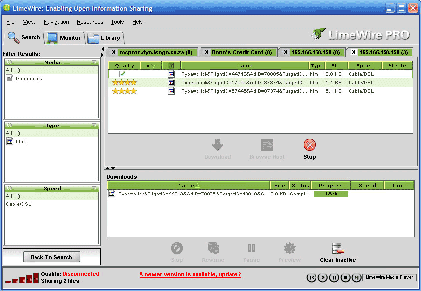
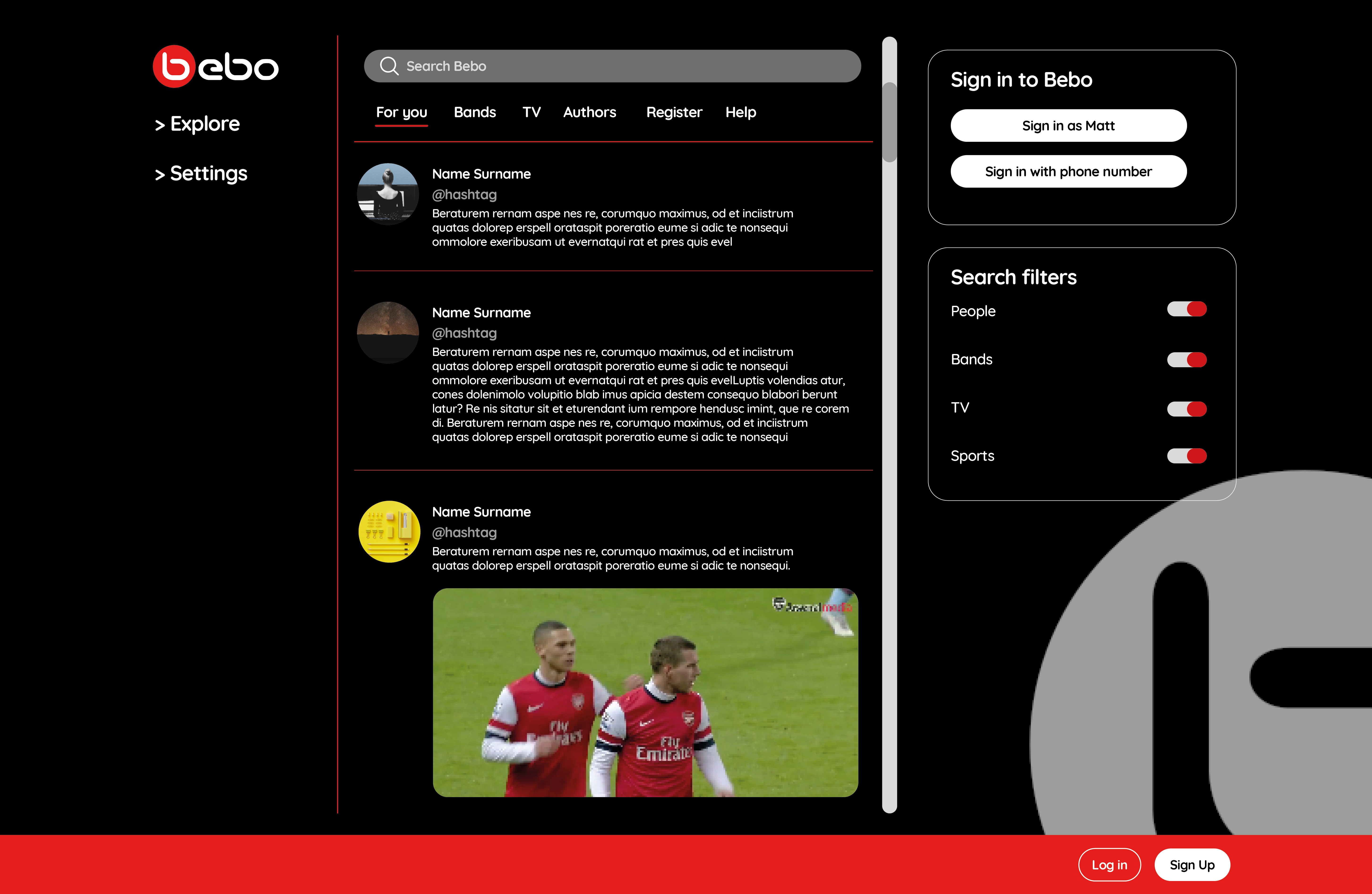
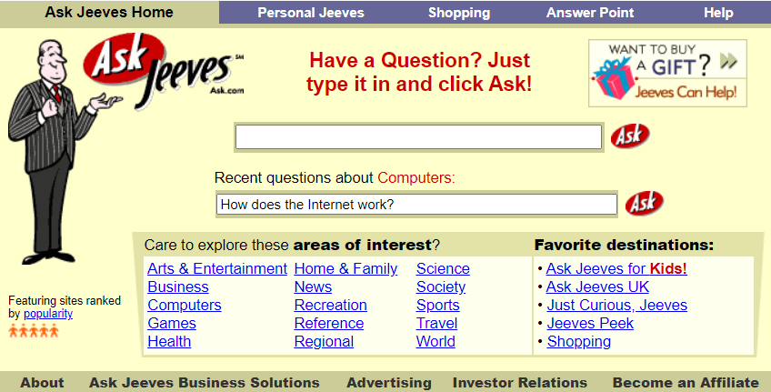
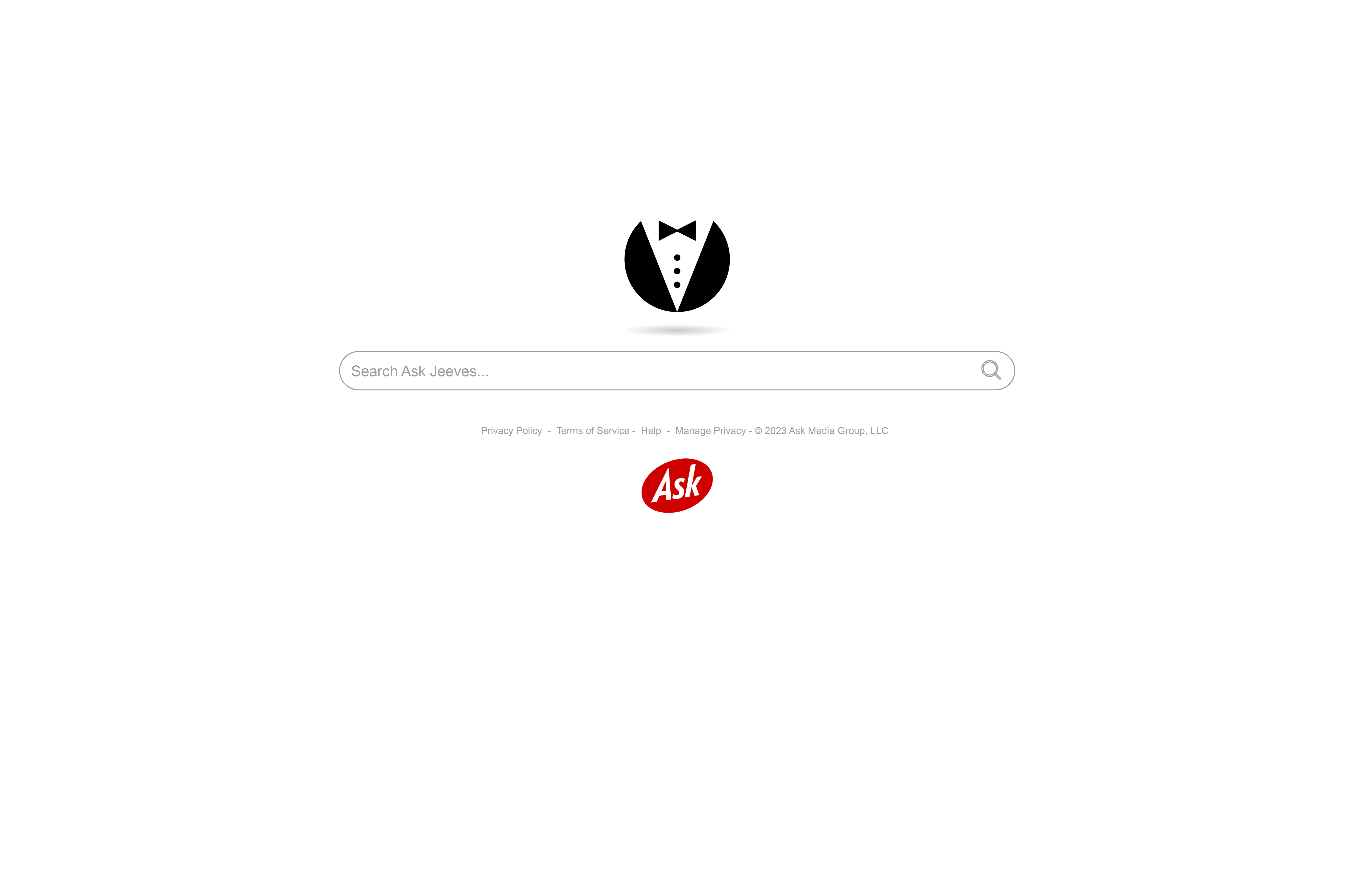
Some of these now dead websites include cultural icons which played a valuable role in our lives at some point, and whose names cause a wave of nostalgia and fond memories to wash over us. Despite the estimated 351 million domain names currently in existence, there are four 90s and 00s legends that stand out from the rest.

In homage to their impact on the days of dial-up, we take a look at these four idols that we miss the most, and give them a much-needed modern facelift.

Click the arrow on the rightbottom to see your favourites brought back from the dead, and use the slider to compare the retro to the modern.

Slider Animation

Use the slider to swap between dead and revived versions of the sites.

Intro arrow right

Navigate using the arrows on the left and right.

Next

Drag left to reveal revived site

The original Limewire site was just a download screen as you can see, and you’ll probably agree it’s somewhat of a mess. But with a modern day facelift and a darker background to help the bright album covers stand out in the (in)famous shade of green, Limewire is gracing our screens once more.
Fans of the original clandestine Limewire will remember the cluttered screen of options to browse through. So instead we’ve taken the increasingly popular minimalist approach with our revival to make browsing much easier, and more focused on the experience of the music itself rather than the commerce.
Bebo was amongst the first of the new age ‘micro-blogging’ social media sites, its beauty lying in the ability to post to all your followers at once, and see updates in the single feed view. We’ve brought beloved Bebo into the 21st century with the new sleek site, but kept the iconic dark aesthetic.
Keeping the search bar functionality and adding in filters means you can stay up-to-date with all the things you love, without consuming the things you don’t. The site is extremely refined compared to how it used to be, with functions such as ‘games’ and ‘luvs’ being left behind as the site – and its users – mature away from these needs.
The biggest attraction to MySpace was always the community feel and bringing people together – which is what undoubtedly led to its popularity amongst the alt community – so we had to keep as much of it as possible. From being able to easily see your latest connections, to being able to keep up with hashtags to stay involved with community discussions, staying connected has never been easier.
One addition to the site from previously is the MySpace Shop. Social sites nowadays are growing their commerce involvement to increase monetisation, led by sites such as Twitter with their premium monthly subscription of ‘Twitter Blue’.
The original Ask Jeeves was somewhat cluttered and VERY 90s, so we’ve stripped it back as much as possible. Focusing on simplicity means the website's functionality is drastically improved – the most important factor of the redesign. Users want something minimalist, clean, and easy-to-use so this revamp brings Jeeves firmly into the modern day.
The iconic butler suit of Jeeves has stayed, but now has a modern twist and doubles up as a sleek, eye-catching logo for the website.