In the previous Web Performance Explained article, we learned about 2 of the most popular free tools to help you measure web performance - Google Lighthouse and WebPageTest. The former of these - Lighthouse - provides an accessible gateway into the world of web performance, whilst the latter - WebPageTest - captures more data and generates more detailed reports, though has a steeper learning curve.
Now, in this latest article, let’s dive head first into the practical side of web performance optimisation with a few quick and easy ways you can improve your website’s performance.
Reduce size of images
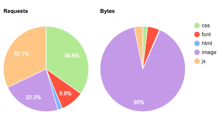
If you don’t handle images correctly, they can quickly get out of control and become a major web performance problem. Take this snippet from a WebPageTest report of an image-heavy website for example. Here, we can see that whilst only 23% of requests are for images, they account for 90% of all bytes loaded. That’s a lot of bytes which the browser has to load!
It’s important to optimize your website’s images so browser’s spend less time having to download them.
Here are a few tips:
Serve appropriately sized images
On a 4k monitor? Display a higher resolution image to make sure it’s crisp.

On a mobile device? Serve a smaller image which better frames the subject and is lower in filesize.

We can do this in HTML using the srcset attribute.
In the code snippet below, for displays with a standard pixel density (Like a 1080p monitor), we’re serving the my-image.png file as is.
However when the pixel density is doubled (Think Mac retina displays or mobile devices with hi-res screens), we’re serving a different file called my-image-2X, which could be anything, but generally would be a higher res version of the same image to prevent blurring on these devices.
<img src="my-image.jpg" srcset="img/my-image.jpg 1x, img/my-image-2X.jpg 2X">
If the browser doesn’t support srcset, it just falls back to the standard src attribute.
In addition to display pixel density, there’s plenty more triggers which let you serve responsive images.
By using srcset, we load the right image for the device, rather than spending precious time downloading the same hi-res image everywhere.
Image compression
Reducing the size of images through compression is another good way of improving load times, as it’ll take the browser less time to download them.
There’s plenty of ways to go about this:
Apps
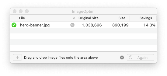
You could manually compress images using apps. Below is a free image compression tool for mac called ImageOptim.
Wordpress plugins
If you have a wordpress website, you can install plugins like Optimole or imagify which automates this for you as images are uploaded.
Build process
If you’re a developer, then you can also automate image optimisation through task runners such as Gulp using an npm package called imagemin. It gives you full, granular control over what and how you optimise, so if you want to compress images without sacrificing quality, then you can do so.
File formats
Using the appropriate file format for the type of image is also a quick way to reduce file sizes. The rule of thumb for picking the right format goes like this:
Is it a photograph of something? JPG is your best bet?
An illustration or an icon? SVG, or if that’s not possible, then PNG.
I would also recommend taking advantage of next gen file formats, such as Google’s WebP, which allow you to compress images beyond what these traditional file formats would allow for.
If you’re on an Apache server, add the below code into your .htaccess file for a neat trick.
RewriteEngine On
RewriteCond %{HTTP_ACCEPT} image/webp
RewriteCond %{DOCUMENT_ROOT}/$1.webp -f
RewriteRule (.*)\.(jpe?g|png) $1.webp [T=image/webp,E=accept:1]
When a browser request is made for a jpg or png, the server will now do the following:
1. Check if the user’s browser supports WebP.
2. [IF NO] Send the JPG/PNG.
3. [IF YES] The server checks if a WebP file with the same filename exists (For example, audi-a3.webp for audi-a3.jpg).
4. [IF FOUND] The webp is sent instead of the original image, whilst preserving the filename. The browser will receive the audi-a3 webp as audi-a3.jpg, meaning no HTML changes are needed!
5. [IF NOT FOUND] Send the JPG/PNG.
Lazy load images and video
On any website, you should only download what you need. If you have images or videos which are further down the page or in a popup triggered under certain conditions, then these assets are good candidates to be lazy loaded because they aren’t essential to load the page.
Lazy loading allows us to delay the loading of assets like images until the user requires them. This reduces the initial number of requests and can speed up the page load considerably.
To implement lazy loading, in Chromium browsers like Chrome and Edge, it’s as simple as this:
<img src="my-image.jpg" loading="lazy">
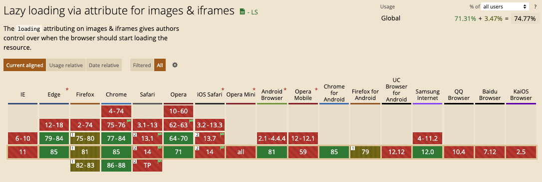
When in place, as the user scrolls down the page and these images enter the viewport, the browser will trigger a request to download them. However, this native method isn’t supported across all browsers yet, as this compatibility chart from caniuse shows us.
For browsers like Safari, lazy loading can be implemented with the Intersection Observer API in JavaScript. Here’s a useful Intersection Observer tutorial by Google to get you started.
Text Compression
When text assets are sent from the server to the browser as a website is being loaded, you can compress these files using special file formats.
The oldest and most widely used of these is gzip, which has been around since the earliest days of the web. Here’s a comparison using a CSS file, showing with and without gzip.
The other widely used compression format is Brotli, which is a more recent format developed by Google to replace the ageing gzip.
With Brotli, you can achieve even greater levels of compression!
Both of these compression formats are usually enabled via server config. The larger the file, the higher the compression, which means text compression compliment large files like JavaScript bundles quite nicely!
How much of a difference does compression make to the loading of a website? We can find out using WebPageTest, where we’ll run 2 performance audits on a website. One with compression enabled and one without, both under a slow 3G connection,
Here’s what happened:
The difference is clear; websites with compressed text assets load much faster. Who would’ve guessed?

This is best seen in a side by side video comparison. Neither fares well on this slow 3G connection, but one is certainly quicker than the other.
Summary
These quick wins should set you going on your web performance optimisation journey! As we’ve seen here, some of the biggest wins can be made from the smallest changes to your website’s code or server config.
Just remember that performance optimisation isn’t a one off, but a continuous process which should happen as the website continues to grow and develop.
To learn more about our quality range of Web Hosting or high-performance Cloud Servers, take a look at our website.
